Rebranding Ozark Country Market: A Journey from Farm to Label
Discover how we revitalized Ozark Country Market with a cohesive new brand identity that highlights their homegrown charm and quality products.

Client Background
Located in Heber Springs, Arkansas, is the Ozark Country Market, a regional gem offering a variety of local products including farm-fresh produce, jams, honeys, nuts, eggs, as well as a garden center with a wide selection of seasonal plants and gardening supplies. When new ownership took over, they sought to modernize and refresh the market’s brand image to better reflect their vision and appeal to both existing customers and new ones.
We were approached by Ozark Country Market for a comprehensive rebrand, including the creation of a new logo designed to be effectively applied to all product packaging and promotional materials. In this case study, we’ll explore our approach in developing a cohesive and dynamic design system that could seamlessly extend from their artisanal products to their gardening essentials, offering flexibility for future implementation.

Challenges Faced
- Maintaining Authenticity: Balancing the desire for a modernized brand image while preserving the authentic, local charm and appeal of Ozark Country Market.
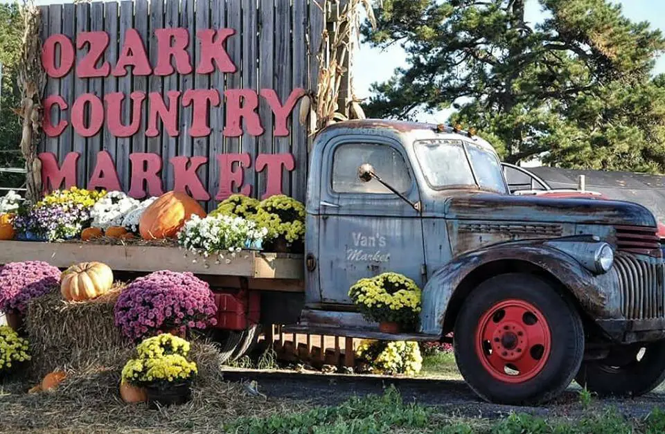
- Standing out in a competitive landscape: The owners were forward-thinking and receptive to creative direction with one main requirement: incorporating their antique truck, a sort of mascot for the business, into the brand’s identity. Amidst widespread nostalgia-driven branding our challenge was to innovate and avoid any visual clichés while incorporating this element authentically.
- Implementation Across Diverse Products: With such a variety of beautiful ingredients and visuals to draw from, we felt it would be a waste to adopt a ‘one size fits all’ approach for all the produce in the store. Instead, our goal was to develop a flexible design system that could enhance each item individually while maintaining cohesion and visual harmony across their entire range of offerings.
I love the artwork for the market—it captures the nostalgic country charm of our landmark business while giving it a fresh, modern look. Best of all, the new branding helps me sell more product.
Kathy Brown
Owner, Ozark Country Market
Strategies Implemented
We took the following steps in our collaboration with Ozark Country Market to cultivate a successful brand transformation that would yield impactful results:
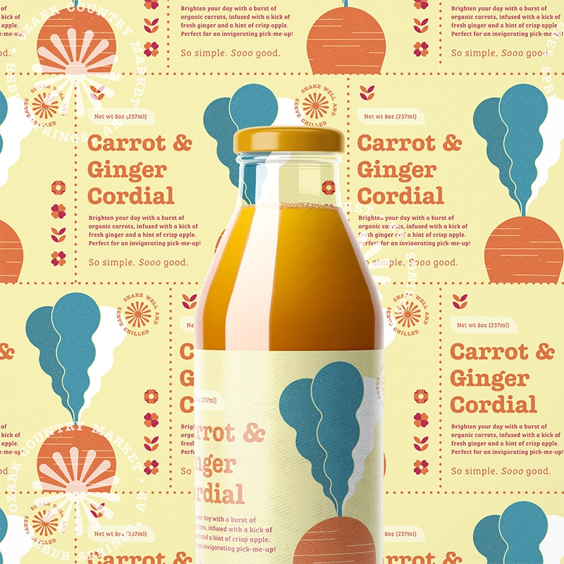
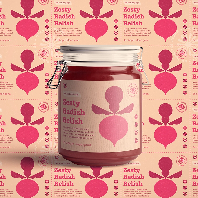
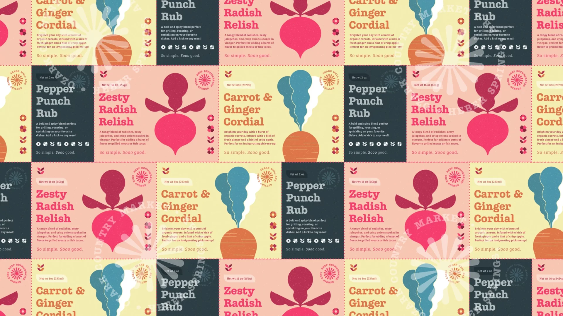
Scalable Design System: We developed a highly versatile and flexible quilt patterning motif that would maintain brand recognition across Ozark Country Market’s diverse product range. It was designed to accommodate a highly variable color palette – even those that deviate from the official brand colors – for special offers, holidays, and to capitalize on the color schemes of seasonal produce.
Pick ‘n’ Mix Illustrations: We adopted a geometric approach to the truck mascot, creating a fresh and distinctive depiction that stands out from traditional truck logos common in the region. This illustrative approach allowed us to implement a versatile ‘Pick ‘n’ Mix’ design system, featuring similarly styled illustrations of strawberries, sunflowers, or other products as needed across the market’s labeling and promotional items. The result is a cohesive and visually appealing brand identity that spans all products.


Conclusion
In revitalizing Ozark Country Market’s brand identity, our approach centered on marrying regional traditions with innovation to create a visually compelling and cohesive brand narrative. By collaborating closely with the client, we tailored a scalable design system that accommodates their diverse product offerings while preserving the market’s authentic charm. Our strategic use of illustrations and patterning not only differentiated Ozark Country Market from their competitors but also ensured flexibility and consistency across seasonal promotions and product lines. In the future, we are confident that Ozark Country Market will continue to flourish with its enhanced brand identity, strengthening their community engagement and customer loyalty.


