This past week, Paypal unveiled their new rebrand, sparking a degree of controversy in online design circles. The new design itself is not particularly divisive or, for that matter, even especially notable: it would be hard for even the most terminally-outraged of online commentators to be upset by a plain san-serif wordmark in a modernised blue color palette. So why the uproar? Perhaps the previous design was a crowd-favorite, elevated to cult status and available on oversized t-shirts from Urban Outfitters? Certainly the overlapping letter Ps of the previous logo were nice enough; an effective way to infer exchange, transparency, ease, collaboration. But still, hardly a classic.

The issue had less to do with the specifics, and more that Paypal is the latest in a long line of high-profile, global brands to depart from their previous or original identity in favor of a sterilized, minimal wordmark. It is not a widely popular trend, with the general perception that the new logos lack the charm, personality and quirks of their predecessors. So why are seemingly so many companies taking their branding in this direction?
There are a couple of practical reasons:
Digital-First Design: Many brands are taking a Digital-First approach, prioritizing the legibility and scalability of their logo across all device sizes. The san-serif fonts simply read better at smaller sizes on apps, social media and mobile websites, and distract less from other visual elements.
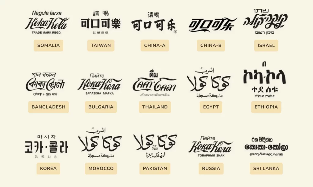
Globalization: For companies operating internationally, nondescript san-serifs lend themselves more easily to cross-script adaptations without losing the essence of the brand, whilst ornate typographic flourishes may not have direct counterparts in non-Latin alphabets. There is certainly a counter-argument to be made here, but when you look at the international versions of even one of the most ubiquitous logos, Coca-Cola, you can see the challenges in retaining the character of the original branding across different alphabets.

Another aspect to this which perhaps particularly applies to digital products, is a diminishment in the importance of the logo itself in the overarching brand ecosystem. Interface design, icons, colors and interactive elements may be more recognisable and distinctive than the product’s logo. We could recognize Duo the owl from a mile away, while Duolingo’s wordmark itself is far less memorable. Would it lessen the appeal or user experience of this language app if the logo was updated to a more neutral wordmark? Not really (although it would likely provoke the same incensed reaction as Paypal’s rebrand).


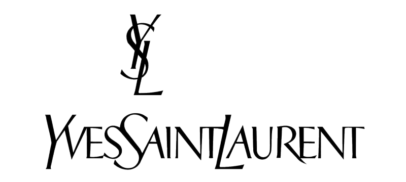
In our view, the less compelling arguments for the de-personalization of logos are stylistic: the desire to appear accessible, less elitist, timeless etc. wanting to connect with “younger, broader audiences who value inclusivity” – that sort of thing. A sterilized attempt at mass appeal can alienate, bore and disengage everyone. Take Yves St Laurent, rebranded in 2012 (we love current affairs). The fun of high fashion is that it is aspirational; elitism and inaccessibility are part of the appeal! To roll out a rebrand devoid of heritage and personality in lieu of bland conformity seems ludicrously inappropriate. Needless to say, we were delighted to see Burberry’s re-rebrand last year as they reverted back to their illustrative Equestrian Knight Design, first unveiled in 1901, paired with beautiful new typography.

To wrap up our thoughts on the subject: are neutralized rebrands good? Are they bad? Are they a sign of societal decline? Maybe, but not really, and it also depends. For some companies, it really is the most scalable and versatile solution for their requirements; for others, it does their brand a disservice. We feel that this approach is often overrepresented as a ‘design trend,’ simply because it has been adopted by some high-profile companies. It’s important to remember that these companies are global players: not only do their rebrands receive significant attention, but they also often have to consider the global implications of their visual strategy — whether it is necessary or well executed is another matter altogether. Perhaps once we’ve signed our billionth client, we’ll rile up the Social Media critics and unveil a new wordmark of our own.


