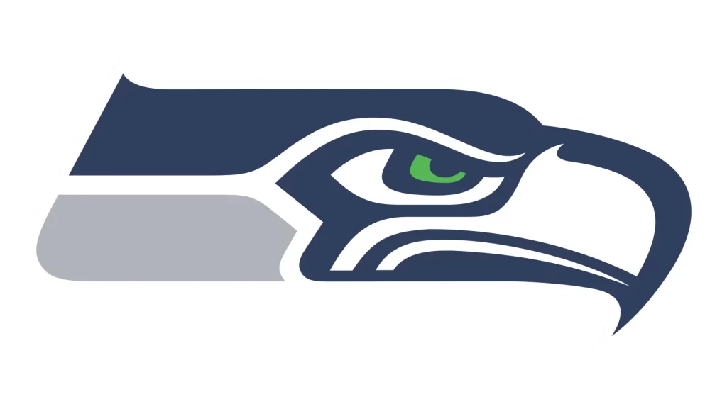
Initially, we were planning on ranking the NFL Team logos from the elite S-Tier designs down to D-Class duds but decided against potentially alienating some 90% of our readership. Instead, we’ve opted to spotlight our favorite logo in the league: the beautiful osprey mask of the Seattle Seahawks. If you’re not a Seahawks fan, rest assured, your team’s logo was a very close second: narrowly pipped at the post for the top spot.

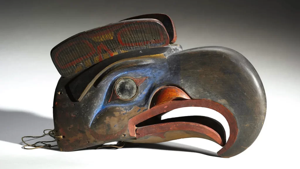
The original Seahawks logo was introduced in ‘76 when the team joined the NFL and was updated in 2002 to the current design. The league’s creative team collaborated and consulted closely with Native American art experts to reflect the culture and art of the Pacific Northwest tribes, in particular the indigenous art style of the Kwakwaka’wakw tribe, incorporating elements from their traditional formline artwork. One of the most significant influences was a Kwakwaka’wakw transformation mask [pictured] — one can clearly see how the stylized forms and flowing shapes informed the logo design. The blue, green and white color-palette was selected to reflect the natural surroundings of the Seattle area – the forests, ocean and fresh water, and the sky.

For us, the beautiful geometry of the Seahawks logo is not just aesthetically pleasing. The incorporation of formline artwork immediately evokes the Pacific Northwest, reflecting the region’s rich cultural heritage and natural landscape: a visual reference that deeply connects the team to its surroundings. We’d love to see more teams follow suit and embrace the wider cultural heritage of their city and state in their branding.


