I’ve always been a fan of Jaguar. Not from a driver’s perspective, mind you – not quite in that bracket (yet). As a child, the little 1:64 Corgi model was the crown jewel of the toybox – a rich emerald green with the big cat emblem, painted in silver, pouncing across the bonnet. Chipped paint from years of slamming against baseboards; slightly chewed tires (a pet? a younger sibling? me?); the once-white interior yellowed by the sun. And yet, still, elegant perfection.
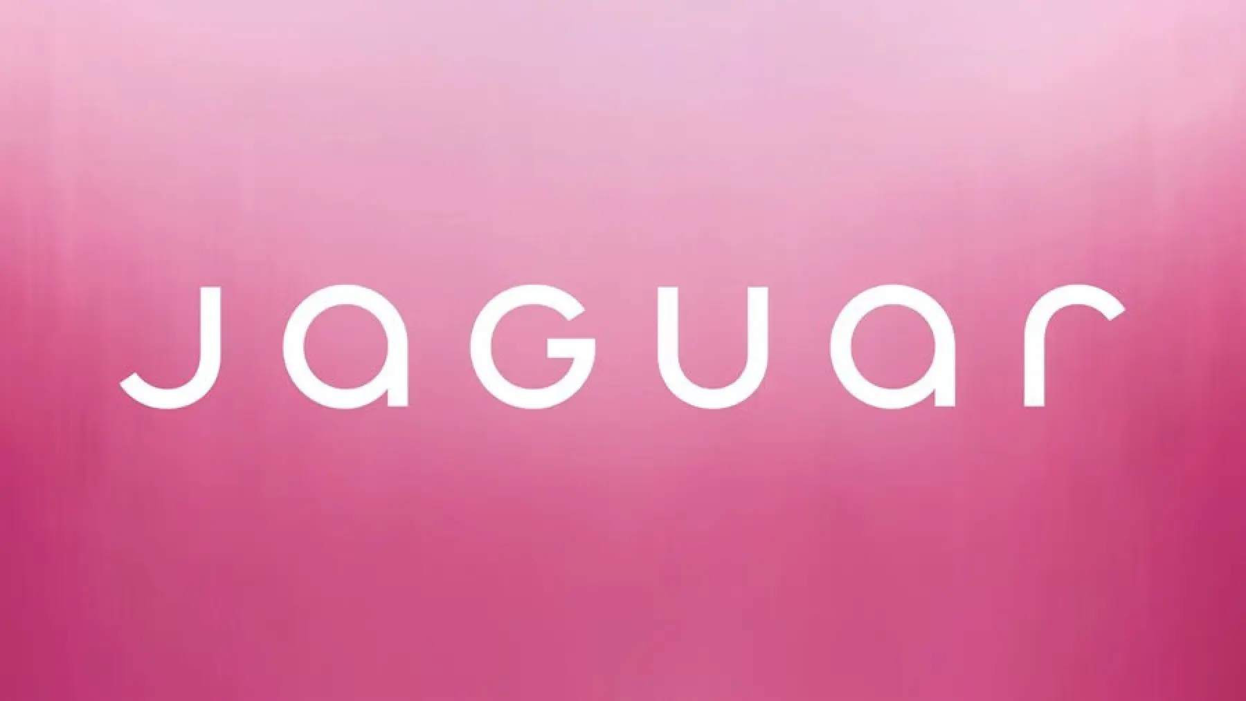
Which brings us to Jaguar’s newly unveiled rebrand. Now, I want to preface this post by linking back to an article we wrote a few weeks back about divisive high-profile rebrands, where we attempted to make the case for how and when they can be a success, even if, when taken in isolation, the resulting logo itself is something of a disappointment. We understand the rationale behind some of these design decisions and are not completely ideologically opposed to the nullification of a logo if it makes sense for the overarching rebrand.
But Jaguar. What the actual…

Leaving aside the rest of their (already) strangely dated ‘New Era’ campaign, which can be neatly summarised as “shit,” let’s discuss the typography. A travesty. A mindless hotch-potch of poorly-crafted UpPer and loWercAse letterforms, none of which complement themselves, let alone each other, rammed together seemingly with one singular objective “make them all the same height vertically, nothing else matters.” Certainly not beauty.
Now, credit where’s it’s due, the accompanying jaguar icon – newly rendered in horizontal stripes – looks good. It has a timeless, art deco vibe to it: would look great embossed on a gold cigarette case, or maybe even (crazy idea, but stick with me here) on the back of a car? It’s hard to say for sure; their new marketing campaign doesn’t seem too keen on showing any of those.
What a dismal downgrade. What a shame. Rant over: I need to clear my head. Gonna go for a drive.


